Albert Heijn Self-Checkout
Designing for speed, clarity, and real human behavior.
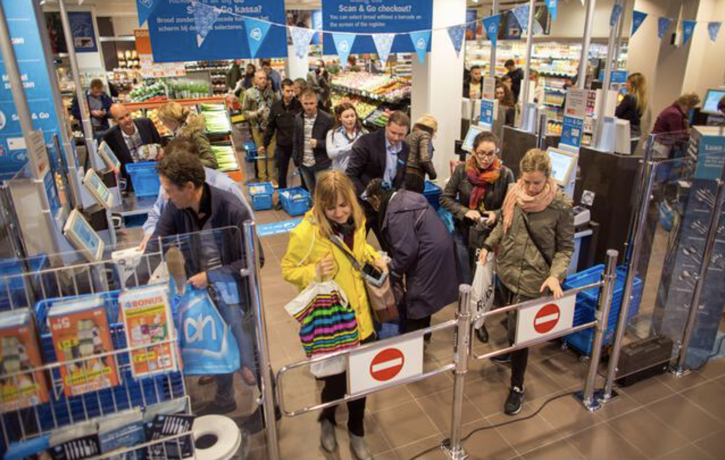
The Context
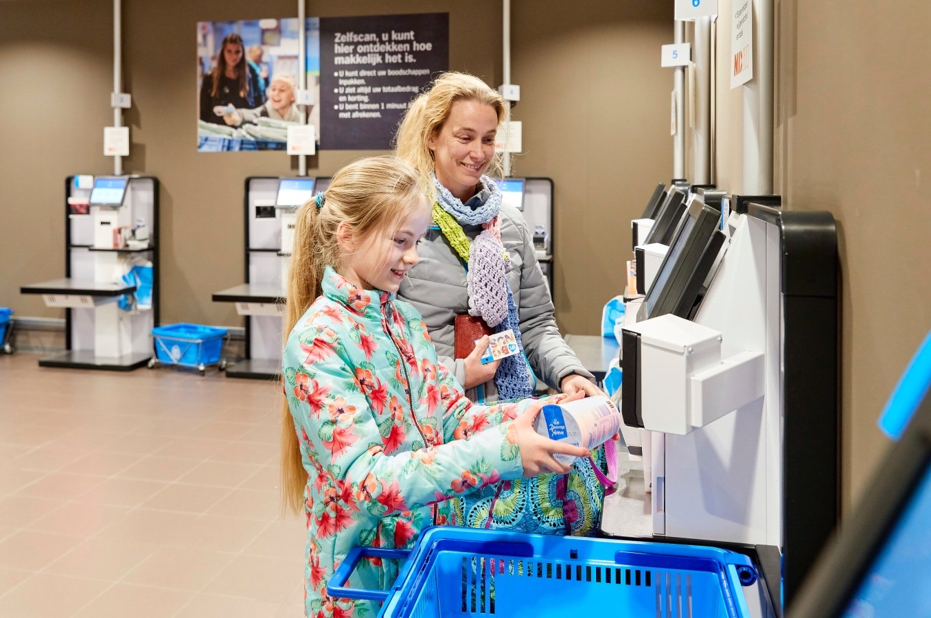
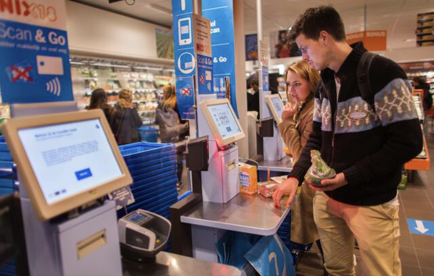
Albert Heijn is the Netherlands’ largest supermarket, serving millions of customers each week. Self-checkout had become essential, but also increasingly fragile. Small moments of friction compounded quickly: adding items without barcodes, awkward physical reach, receipts to exit, language barriers.
“Check out in under 30 seconds.”
The brief sounded simple, but in reality, it required rethinking both the screen and the space around it. A full checkout in under 30 seconds — without training, instructions, or stress. This wasn’t about shaving milliseconds off animations. It was about designing a system that felt obvious the first time someone used it.
We evaluated every step of the flow, including what happens after the screen says you’re done (yes, even the receipt).
My Role
Principal Product Designer
UX / UI Design
Interaction Strategy
Art Direction
Cardboard prototyping
Video Production & Editing
Team
Handmade – Amsterdam
Casper van Huisstede – Product Design & Prototyping
Part ONE
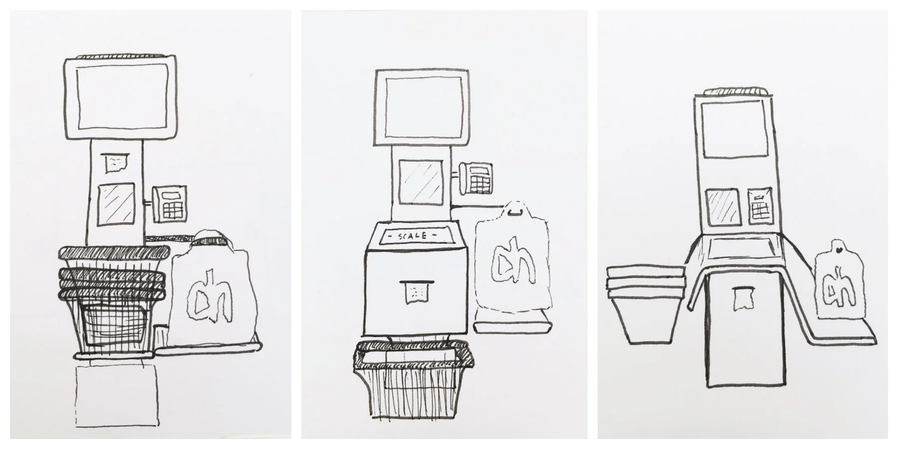
Designing the Physical Experience First
Before touching pixels, we stepped back and asked a simple question:
What does self-checkout actually feel like in a Dutch supermarket?
Amsterdam stores are compact. A few extra centimeters on a kiosk can block foot traffic, create awkward queues, or force people into uncomfortable body positions. So instead of treating the kiosk as a fixed constraint, we treated it as a design variable.
Reduced the physical footprint of the kiosk
Explored screen angle and reach
Designed interactions that could be completed one-handed
This allowed more space for people to move naturally, especially in high-traffic, narrow store layouts.
Part TWO
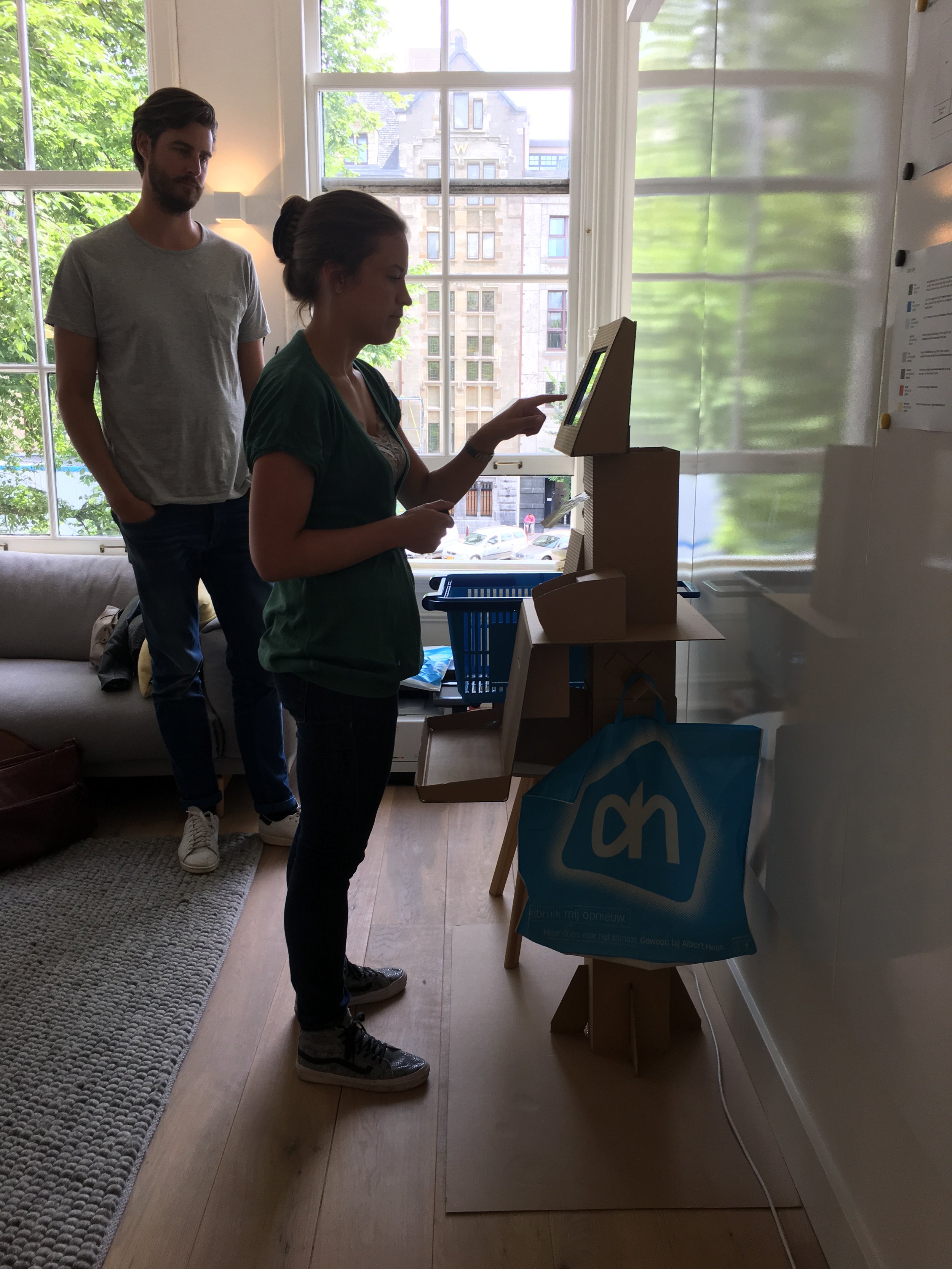
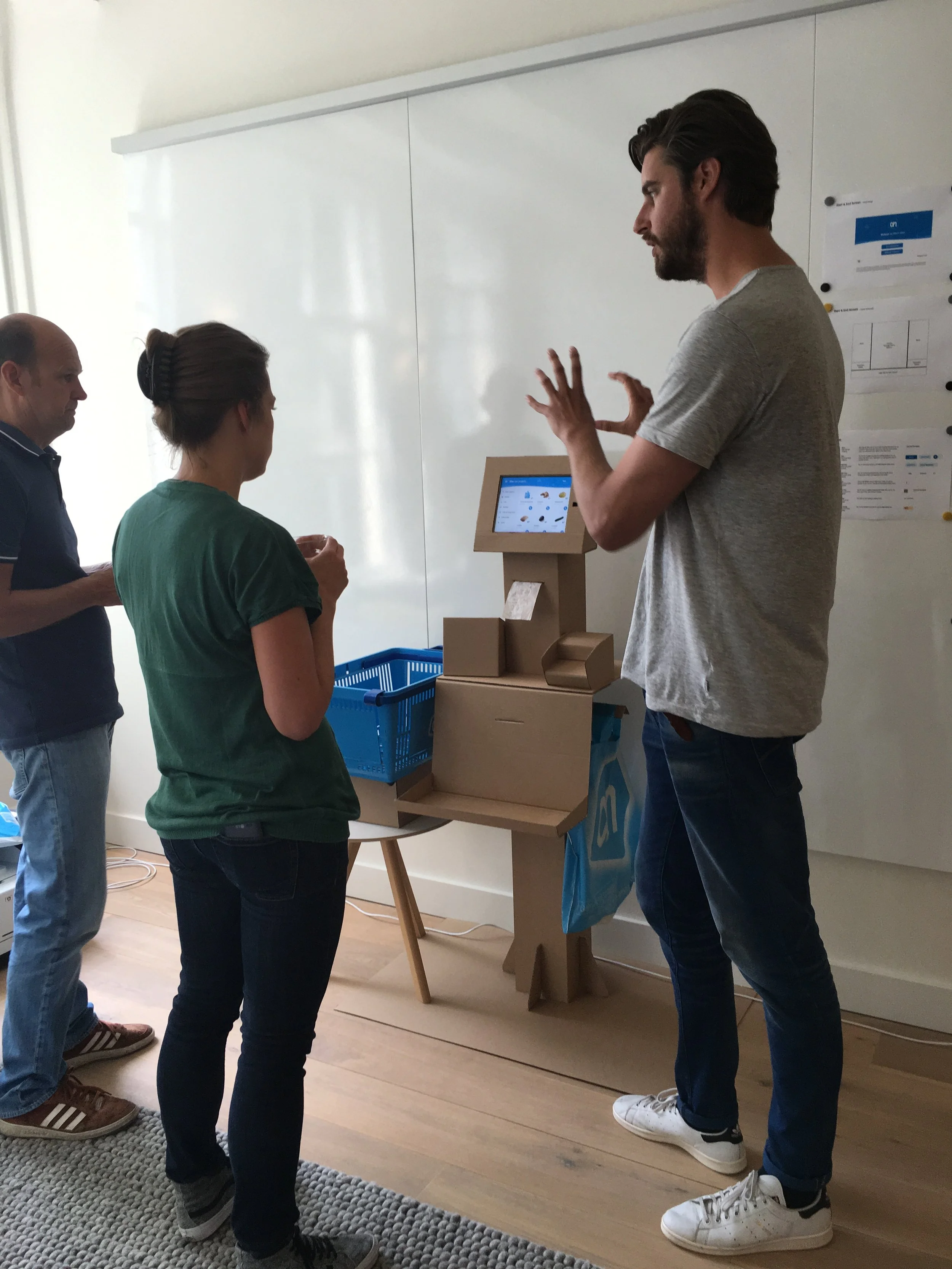
Cardboard Before Code
We built full-scale cardboard prototypes to test how people approached, stood, leaned, and exited the checkout
Cardboard let us answer questions no wireframe ever could:
Where do people hesitate?
When do they look up vs. down?
What moment actually signals “I’m done”?


Part THREE
UX & UI: Radical Clarity
For the interface, we focused on clarity and hierarchy. Living in Amsterdam, we knew a lot of people don’t speak Dutch. We wanted an interface so simple it wouldn’t require switching the UI language (even though it’s still an option).
The interface needed to work for:
Locals, Tourists, Expats…
People who don’t want to change the language setting just to buy groceries
Key Principles
Clear hierarchy over flashy visuals
Strong iconography paired with minimal text
Obvious next actions, even in peripheral vision
THE GOAL:
After one use, users shouldn’t need to change the language—though the option remains.

Intro

Scanning items

Non-Barcode Search

Final Output
Outcome
The final system standardized interactions across Albert Heijn’s self-checkout ecosystem, serving millions of weekly users across the Netherlands.
More importantly, it created a checkout experience that:
Feels fast without feeling rushed
Works across languages without friction
Treats the physical and digital experience as one coherent system
Reflection
This project reinforced something I return to often:
Speed isn’t about moving faster.
It’s about removing doubt.
Self-checkout succeeds when people stop thinking about the interface entirely and focus on leaving the store.