Overland AI
User Interface
The Goal:
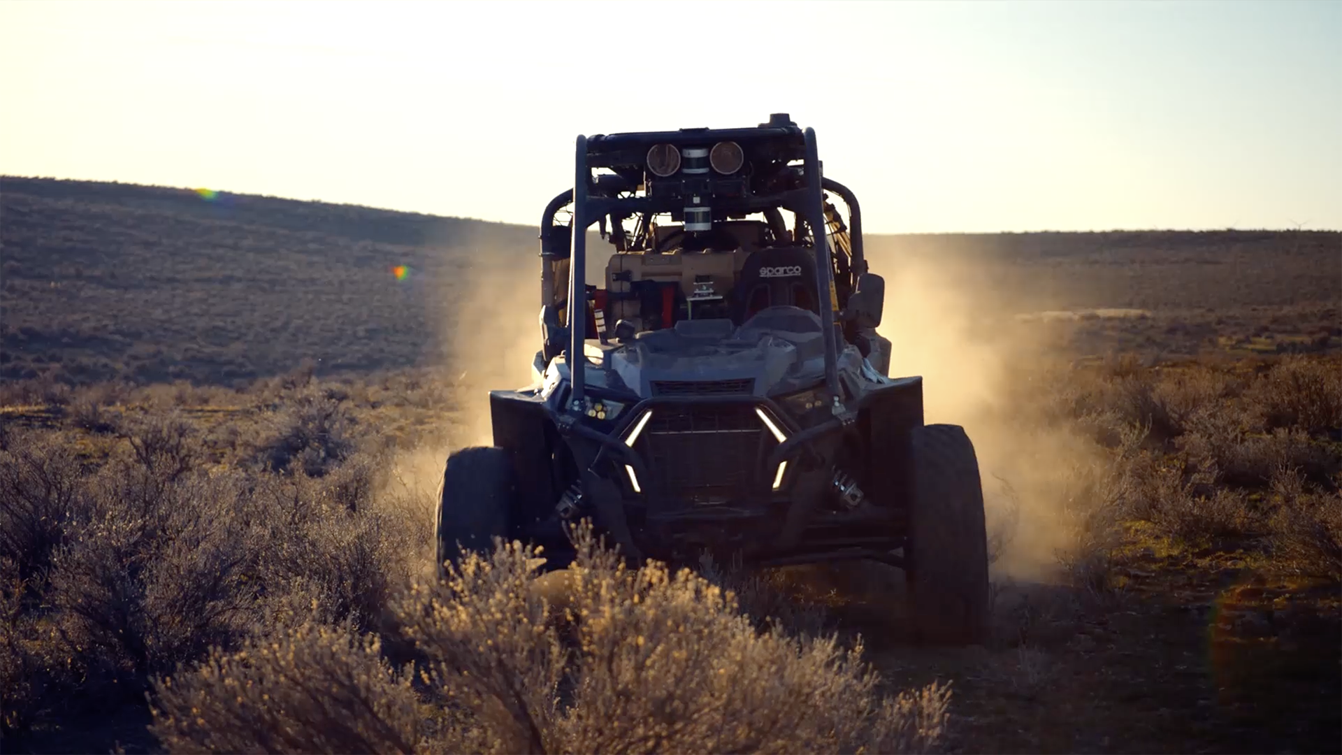
Design Interfaces for Off-Road Autonomous Vehicles
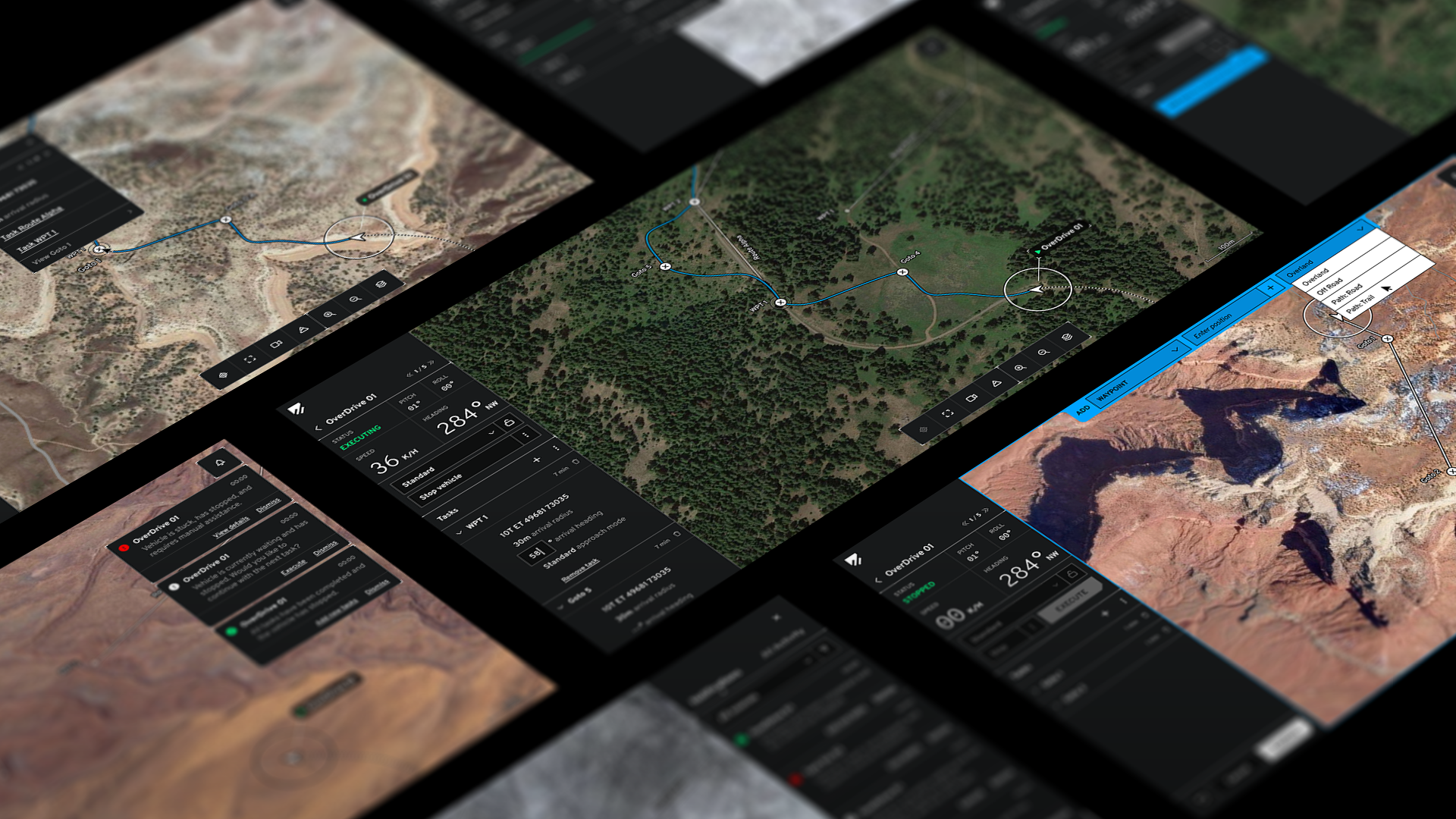
Overland AI, spun out of the University of Washington Robot Learning Lab with DARPA partnerships, asked us to rethink their off-road vehicle interface. Their existing cost-map app, built by engineers, worked technically but lacked trust and usability. We set out to create an application that simplified complexity, gave operators confidence, and scaled to future features.
My Role
Senior Interaction Designer
Interaction + UI Design
UI Prototyping
Visual Design
The Full Team
Teague – Seattle
Clint Rule – Creative Director
Amanda Welch – Interaction Designer
David Smith – Principal Visual Designer
Warren Schramm – Technical Director
Jon Rush – Backend Developer
Daniel Swann – Frontend Developer
Ashley Deal – Project Manager
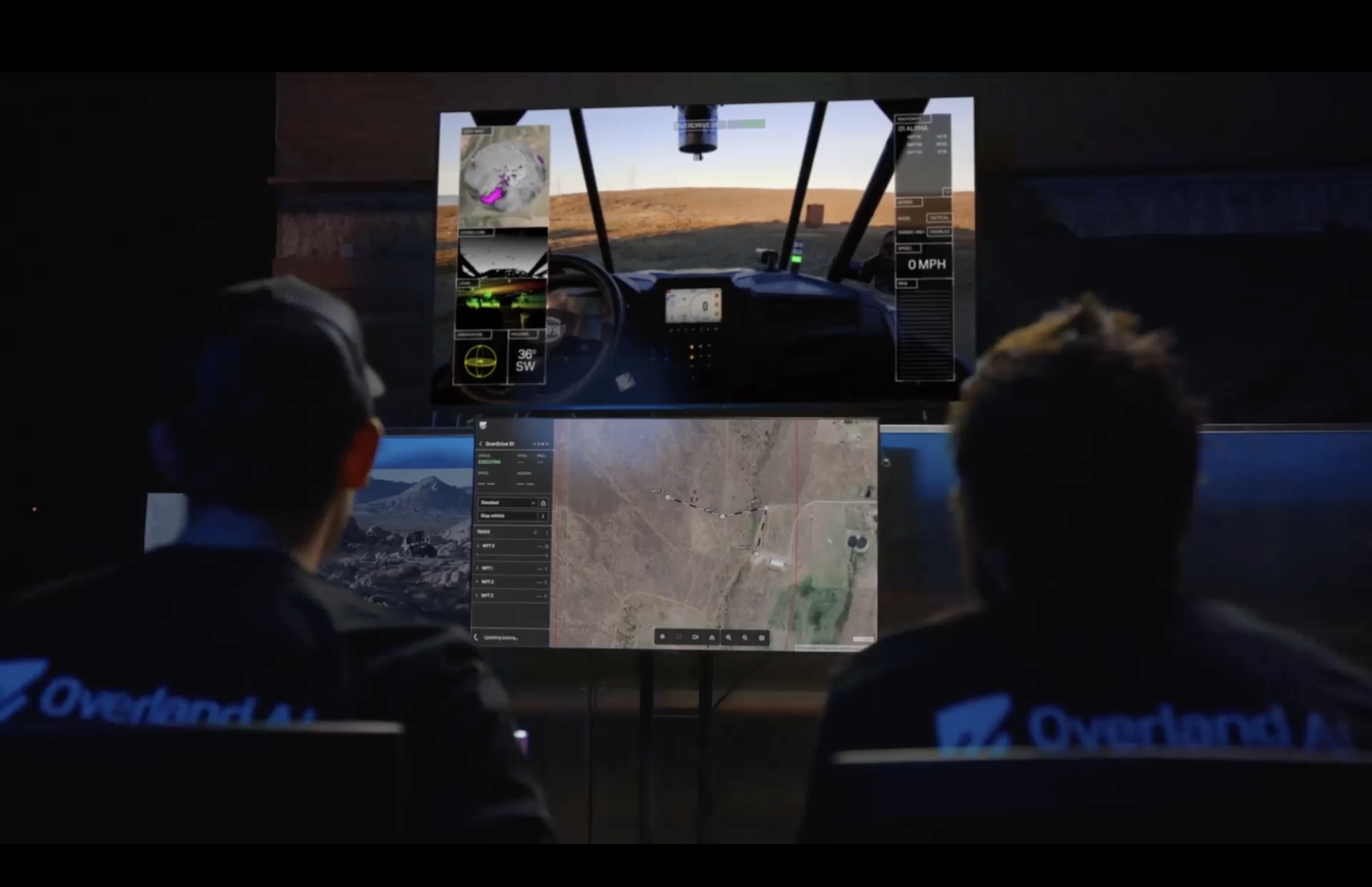
The original interface Overland AI engineers had devleoped.
The Challenge:
Trusting AI in Rough Terrain.
The original interface focused narrowly on cost maps and real-time data. While accurate, it overwhelmed users and didn’t inspire trust.
We shifted the experience toward:
Telemetry, tasks, and mapping checkpoints for better situational awareness
A “Tasking” model that let operators set goals and let the vehicle run autonomously
Smart alerts that only drew attention when necessary
This approach gave users a holistic view while reinforcing confidence in the vehicle’s decisions.

My Role:
As Senior Interaction Designer, I worked with a creative director, principal visual designer, and technical director at Teague. In the first week we built a strategic foundation, then I translated it into wireframes and interaction patterns. My process moved quickly from low-fidelity iPad sketches to higher-fidelity flows, ensuring logical consistency at every stage.
Although I didn’t set the initial visual style, I later contributed to visual design by introducing new features, patterns, and refinements.
Tackling AI Complexity
Balancing Autonomy
Humans excel in understanding subtle clues of terrain and in bad weather, where computer can’t compete. So I proposed two types of routes for flexibility:
High Autonomy: the vehicle chose its own path based on conditions.
Low Autonomy: operators defined precise travel corridors.
This distinction gave users control without overloading them.
A Growing Lexicon
Terms like “path” and “route” caused confusion across our teams. I applied Object-Oriented UX (OOUX) methods to map out a shared lexicon, aligning designers, engineers, and clients around consistent terminology. I created the diagram below to ensure clarity.

Wearing Multiple Hats
Drawing on my visual design background, I created options that balanced aesthetics and usability. Animation, layout, and clarity all contributed to stronger interactions.
Documenting for Engineers
We treated documentation as part of the design, not an afterthought. Detailed annotations, atomic breakdowns of components, and clearly logged questions gave developers clarity and confidence, which reduced guesswork and ensured designs translated smoothly to code.


The Result:
Together, we transformed Overland AI’s complex interface into a tool that was intuitive, scalable, and trusted by operators. The new interaction model balanced autonomy with oversight, while consistent patterns and documentation ensured long-term adaptability.
What began as a six-week engagement has grown into an ongoing partnership, pushing forward the future of autonomous vehicle design.