Starbucks Pro
Design System
Reducing cognitive load in high-pressure, professional environments
Overview
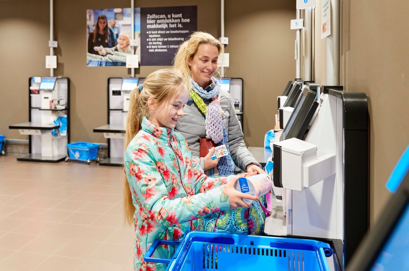
Starbucks baristas operate in fast-paced, high-stress environments using a growing ecosystem of professional equipment. Interfaces had evolved independently across devices, resulting in fragmented interaction patterns, inconsistent mental models, and unnecessary cognitive load.
Our small team at Tactile established a unified interaction and visual system for Starbucks’ professional equipment. I sought to balance legacy hardware constraints, strong individual user preferences, and a deeply ingrained engineering culture that defaulted to “add a screen.”
The goal was not reinvention, but clarity, restraint, and consistency — helping baristas work faster and with more confidence, especially during peak moments.
My Roles
Lead Product Designer (Consultant)
Partnered closely with Starbucks’ internal design, engineering, operations, and research teams
Led interaction strategy, system principles, and design direction
Conducted and synthesized qualitative research with baristas
Advocated for non-screen and low-UI interaction models where appropriate
Awards
International Design Excellence Awards
Digital Interaction: 2023 | SILVER

Context & Constraints
This project lived inside a complex operational reality.
These constraints shaped every decision.
High barista turnover
Average tenure was ~18 months, with ~6 months required to fully ramp up. This made learnability and cognitive load critical design concerns.Highly opinionated users
Baristas were experienced, vocal, and deeply individual in how they worked. What felt “intuitive” to one barista could be actively disliked by another. There was no single “perfect” workflow — only a defensible middle ground.
Legacy hardware and patterns
We could not redesign everything from scratch. Many devices already existed, and new designs had to work within established physical constraints and interaction patterns.Engineering bias toward screens
Screens were easy to prototype and demo, and often became the default solution — even when they added friction or visual noise in a high-pressure environment.
Research → Insight
Cognitive overload was a real problem, especially during rushes. Baristas were juggling multiple machines, orders, and physical movementsUI competed for attention rather than supporting it.
Baristas relied heavily on muscle memory and peripheral awareness, not deep visual inspection.
Consistency mattered more than novelty. Familiar patterns reduced hesitation, even if they weren’t “optimal” in isolation.
Screens were often the wrong tool. Many tasks were recognized by touch or sound. And they, required quick confirmation or binary actions — not lists, menus, or visual density.
The core insight:
In professional food environments,
less UI is often better UI.

Strategic Decisions & Tradeoffs

Ideations for how two baristas could share a device
Screens vs. No Screens
A key tension was whether every interaction needed a screen.
Engineering teams often proposed screen-based solutions because they were flexible and easy to prototype. But in practice, screens:
Increased visual scanning
Required more attention
Encouraged feature creep
I pushed the team to step back and ask:
What does the barista actually need in this moment?
A notable win was advocating for a scan-based interaction over a traditional list UI. This reduced visual parsing, aligned better with baristas’ physical workflows, and lowered cognitive load — even though it was initially harder to prototype.

Iteration over Reinvention
We intentionally avoided radical redesigns. Instead, we:
Identified existing patterns that already worked
Standardized behaviors across devices
Made incremental improvements that compounded over time
This approach respected baristas’ existing mental models and reduced retraining costs.
Wireframes for a new device
Designing for the Middle
Given how individualized barista preferences were, we avoided optimizing for edge cases. The system aimed to:
Support the majority of workflows
Be learnable quickly
Stay out of the way once learned
This meant saying no to certain features — even when individual users requested them.
Mapping orders through different system paths

My sketchbook of design considerations around physical and digital interactions
Our Tactile team explored thoughtful use of animation to convey actions
Design System Approach
The resulting system focused on:
Interaction Principles
Reduce decision-making at moments of pressure
Favor physical and implicit interactions over visual ones
Support muscle memory and peripheral use
Be consistent across devices, even when hardware differed

Visual Language
Elegant, restrained, and purposeful
No decorative color — color was only used to communicate state or urgency
Typography and layout optimized for quick glances
Minimal flourish to reduce noise
Every element had to justify its presence.
When new hardware was introduced, it followed the same interaction and visual patterns — reinforcing familiarity rather than novelty.


Outcomes & Impact
(Qualitative)
While this work did not lend itself to clean quantitative metrics, impact was visible through:
Baristas completing tasks with greater confidence during testing sessions
Reduced hesitation and fewer clarifying questions when encountering unfamiliar devices
Positive feedback from stakeholders on improved consistency and clarity
Alignment across teams around when not to use a screen
Perhaps most importantly, this work helped shift internal thinking — from “what can we show on a screen?” to “what does the barista need right now?”
Reflection
This project reinforced that good professional UX is often invisible. Success wasn’t flashy interfaces, but calmer interactions under pressure.
If I were to extend this work further, I’d focus on:
Measuring cognitive load more explicitly in future testing
Continuing to codify when screens are appropriate and when they aren’t
Strengthening onboarding pathways using the system as a foundation
Why this Matters
Designing for professional environments requires a different mindset than consumer apps. It’s about restraint, respect for expertise, and designing with users who already know their craft — not teaching them how to do their jobs.
This project was an exercise in judgment as much as execution, and in choosing simplicity even when complexity was easier.