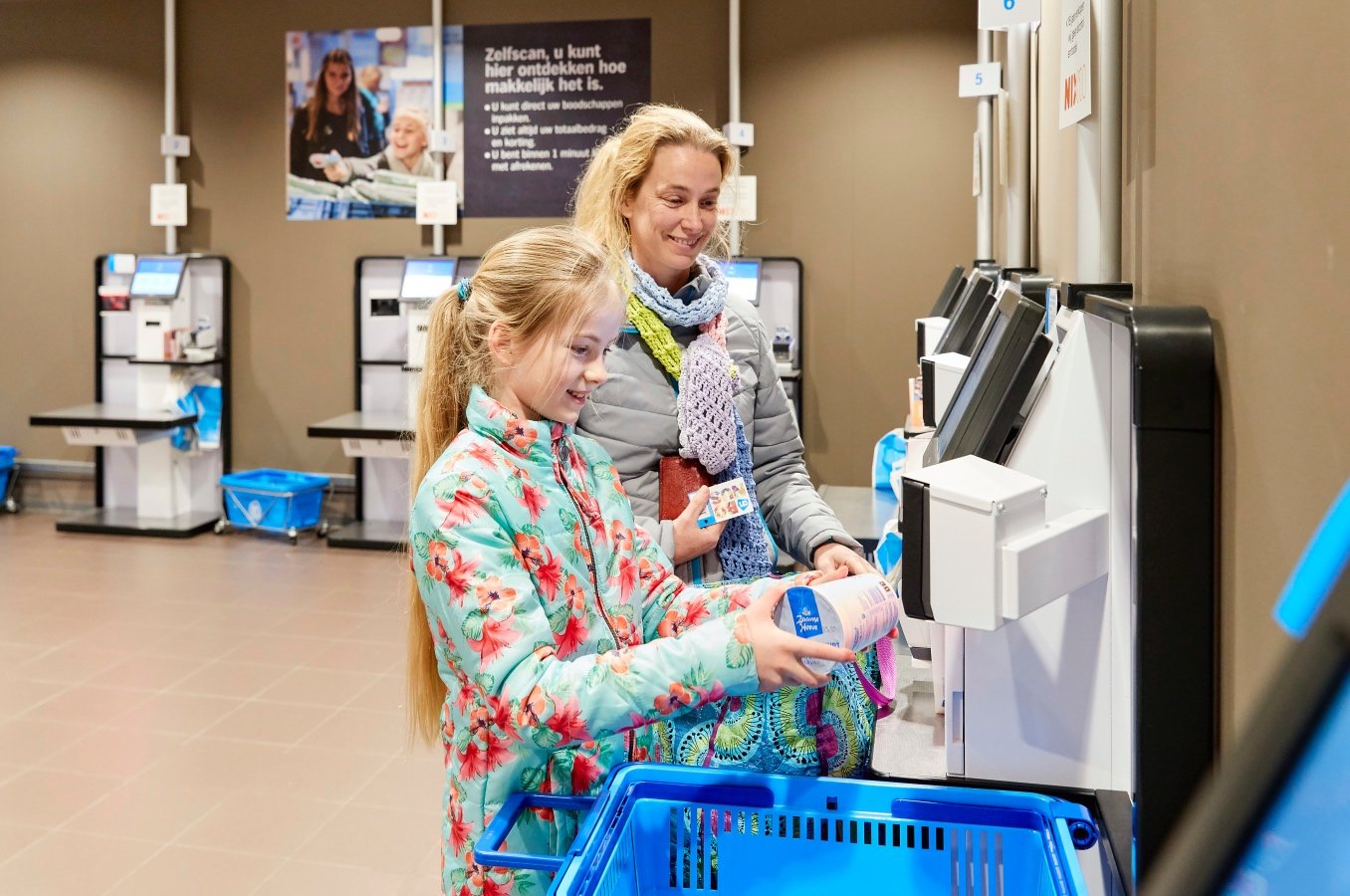
Albert Heijn Self-Checkout
Check out in less than 30 seconds.
The Intention
Holland’s largest supermarket, Albert Heijn needed an update to their self-checkout machines. The overall goal was to speed up the check-out experience, and make it as simple as possible. The target was full check-out in less than 30 seconds for the average shopper. We looked at every detail, even at how the receipt printed after finishing up on screen.
My Role
Principal Product Designer
UX / UI Design
Art Direction
Cardboard prototyping
Video Production and Editing
The Full Team
Handmade – Amsterdam
Casper van Huisstede – Product Design & Prototyping
Part ONE
Sketches
While designing the on-screen interface, we wanted to holistically consider the physical kiosk itself. Space is limited in places like Amsterdam, and so by decreasing the kiosk footprint, we could also give more room for people to move and physically engage in the check-out experience.
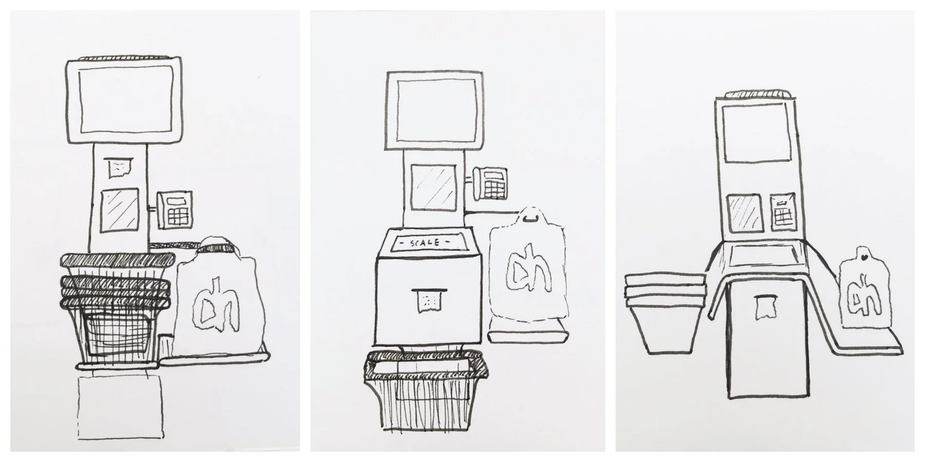


Casper and I are forces to be reckoned with… when it comes to hot-glue guns.
Part TWO
UX / UI
For the interface, we focused on clarity and hierarchy. Living in Amsterdam, we knew a lot of people don’t speak Dutch. And so we wanted the interface to work easily enough so that after one use, people wouldn’t have to change the onscreen language (even though that’s still an option).

Intro

Scanning items

Non-Barcode Search

Final Output