UX Design Process
Starbucks Siren Sense
Optimize Time and Energy in Stores Using IoT Data.
The Intention
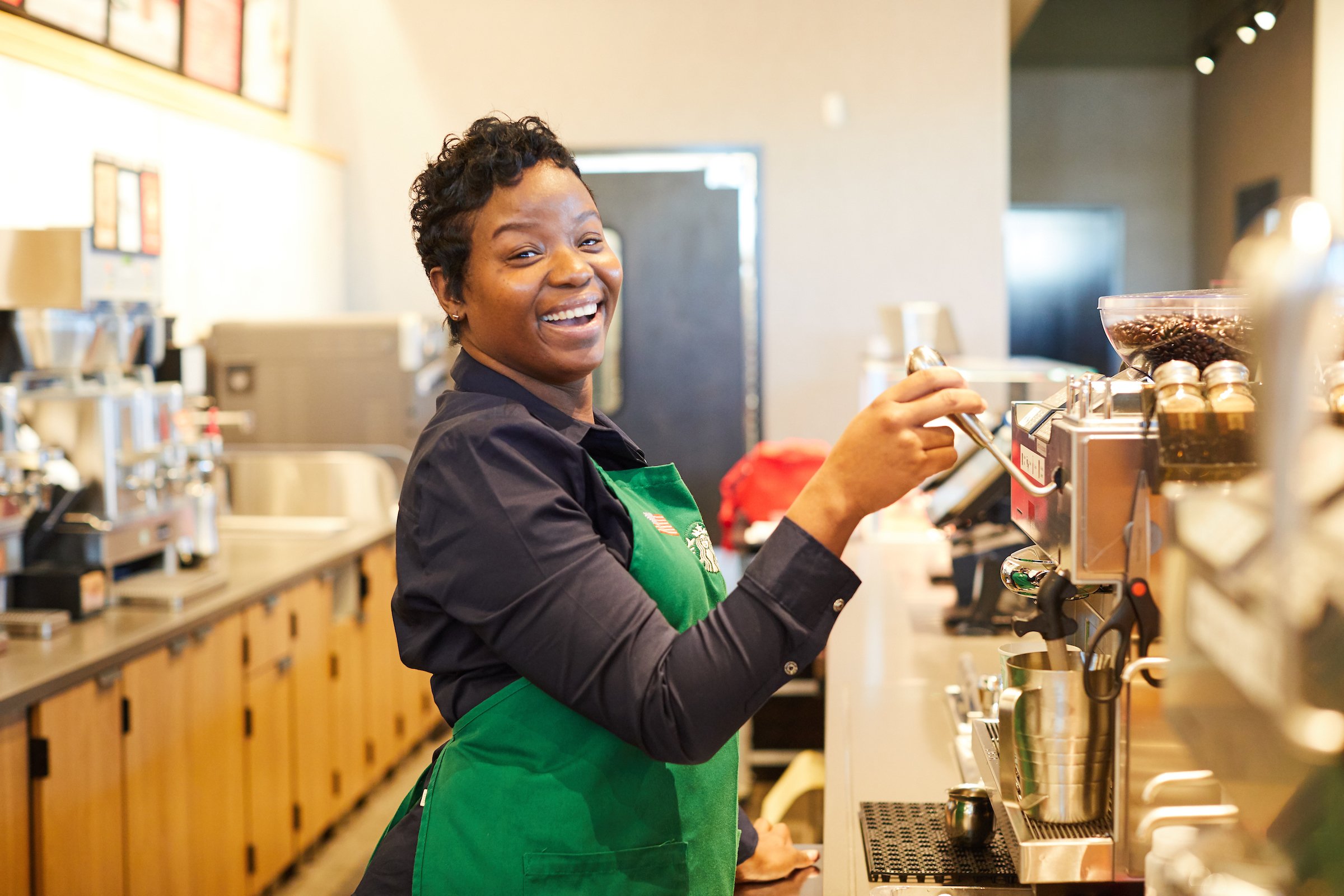
The project began with a simple, practical goal: improve the way Starbucks partners checked and logged fridge temperatures across stores through an easy-to-use tablet app. The process had previously been paper-based, which was time-consuming, difficult to track, and prone to missed issues that could lead to food waste.
Using Internet-of-Things (IoT) technology, the new app delivered real-time updates and alerts for connected equipment, helping partners catch problems early and prevent larger issues. Over time, the scope expanded from basic temperature logging to managing all IoT sensors within a store. By the end of 2022, the app had rolled out to every North American Starbucks, following an initial launch in 4,000 stores.
My Role
Senior UX Designer
UX Design
UX Writing
Visual Design
The Full Team
Tactile – Seattle
Marcus Pape – UX Director
Michael Akers – Front End Development

UX Auditing and Wireframing
Situational Research
We began by working closely with Starbucks to understand how store teams managed refrigeration checks and where the pain points were. Together, we mapped the end-to-end partner process, defined what success looked like, and identified opportunities for the app to simplify and improve it.
Maintaining Alignment
Our focus was on two key challenges: how to alert partners immediately when IoT sensors flagged an issue, and how to help them recognize patterns that could prevent future problems. Once we aligned on priorities, we created user flows and low-fidelity wireframes to define the larger journey. Weekly check-ins with Starbucks and their engineers ensured edge cases were captured and the design aligned with technical realities.
Functional Visual Design
Although the app was built to be practical and function-driven, we treated visual design as an essential part of usability. Clear hierarchy, smart task highlighting, and small visual flourishes increased ease of use and partner engagement.
To move quickly, we gradually increased wireframe fidelity as the design progressed. Adding color and visuals improved clarity: a warm palette with green accents directed attention to critical tasks, while icons in primary colors highlighted statuses and issues. Progressive disclosure minimized clutter and reduced cognitive load. Together, these elements created a streamlined, approachable experience.

Serving Up
Brand Standards
Starbucks maintains a high bar for brand consistency across its ecosystem. We worked with their brand design team to seamlessly apply existing guidelines to the app. Where needed, we created new components and shared them back for future use.

Delivering Results Efficiently
Design handoff was more than just polished mockups. Our team collaborated closely with Starbucks engineers to ensure smooth implementation, from addressing edge cases to deploying software remotely across iPads in stores.
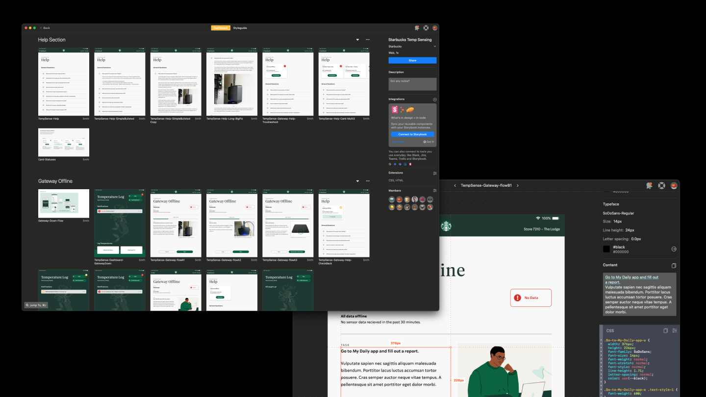
We used Zeplin to provide engineers with precise specs and added detailed annotations to reduce guesswork and build confidence in the process. This extra investment in documentation streamlined delivery and sped up development.
Data that Empowers People
The final app created value on multiple levels:
Technicians could diagnose refrigeration problems more quickly.
Store partners could manage IoT sensors directly, moving away from paper logs.
Managers gained visibility into store performance and could benchmark against others.
The rollout was so successful that Starbucks returned to expand the app’s scope with additional features and refinements.

Quotes from Starbucks
“This is quality work and much better – great use of the space, and aesthetically pleasing. Additionally, the user flow looks great, and the new headers are perfect. Really nice. I look forward to seeing the implementation!”
— Principal Engineer at Starbucks
“Agreed, this is great! I can’t wait to get this in front of our store partners.”
— Project Manager at Starbucks


