
Microsoft
Silverlight
Create a brand identity for an entirely new product.
The Intention
The Portland office of Razorfish had a strong relationship with Microsoft, designing everything from websites to software packages. So when it came to developing an identity, they were open ears to anything we could imagine for their product.
My Role
Senior Designer
Brand Identity Design
Extra Credit
Razorfish – Portland
Bob Vandehey – Creative Director

Engage Curiosity.
The Beginning
I learned from this Silverlight project to bring my own personal interests to the table, as they can resonate with others. Engaging personal curiosities of team members can always be worth exploring.
At Razorfish, I was part of a small team of designers that contributed ideas to the project. We had a simple brief on what Silverlight did, but nothing else. And from that, I had an idea….
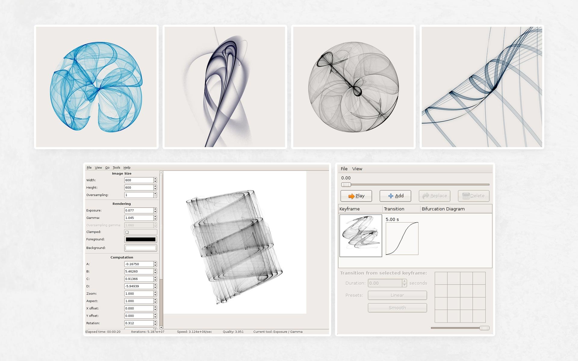
Images produced with the software Fyre (formally known as de Jong Explorer)
Follow Conceptual Intuition.
The Process
While exploring, I remembered a concept that intrigued me visually in school: Chaos Theory. The mathematical concept shows that simple dynamical systems can produce unpredictable results. Yet mapped out over time, it will look as if there is a pattern.
The images of Chaos Theory seemed to be a perfect blend of science and visual art. And that’s a great foundation for Microsoft Silverlight.
From this mathematical theory, I took images created with the software, Fyre and built it into a logo for our presentation.
Our Creative Director at the time, Bob Vandehey (who also designed the Microsoft Bing logo) continued the work to finalize the brand identity.

Plotting chaos with the double-rod pendulum

Above: My initial concept first delivered to the Razorfish team and Microsoft
Below: Final design